The assignment was to pick an existing Olive Oil and repackage it with at leat two designs.
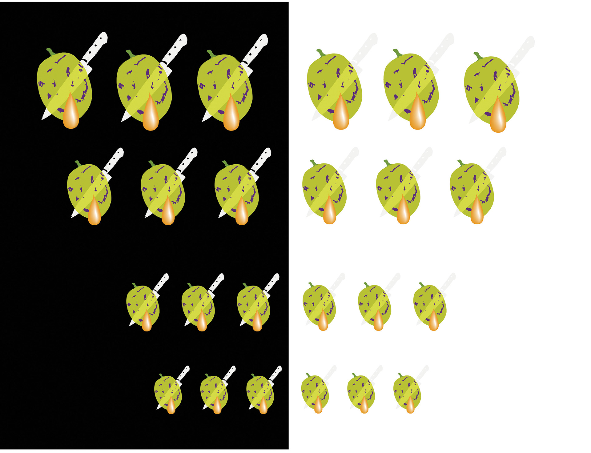
I used four. Here are different sized olives that I constructed for the packaging.
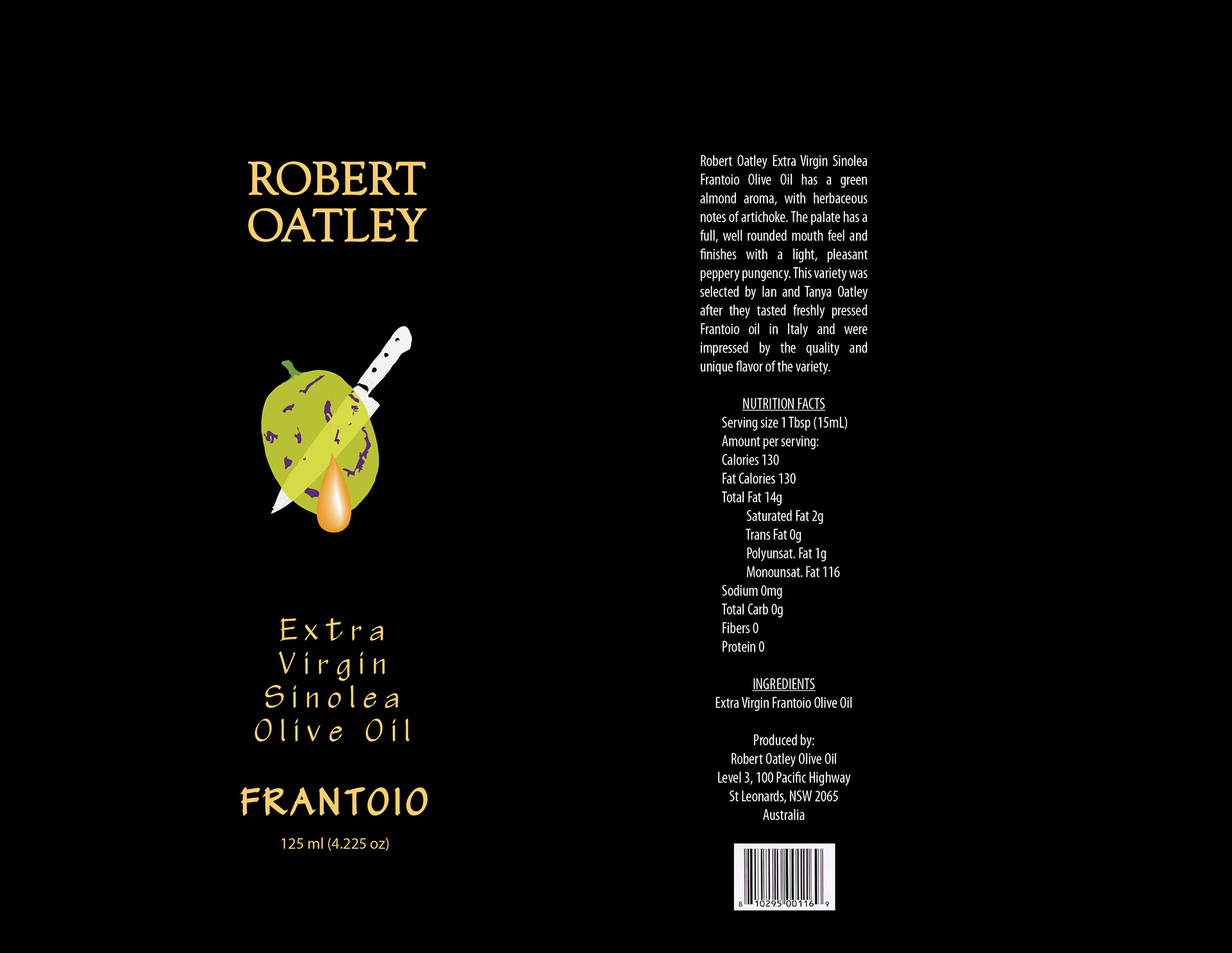
Box that the bottle was packaged in. "Top Shelf" quality olive oil in a simple elegant bottle, info and ingredients on the box for purchaser. Once purchased, the bottle could be displayed in the Kitchen without all the required labeling. "Less Is More" display on kitchen counter top.
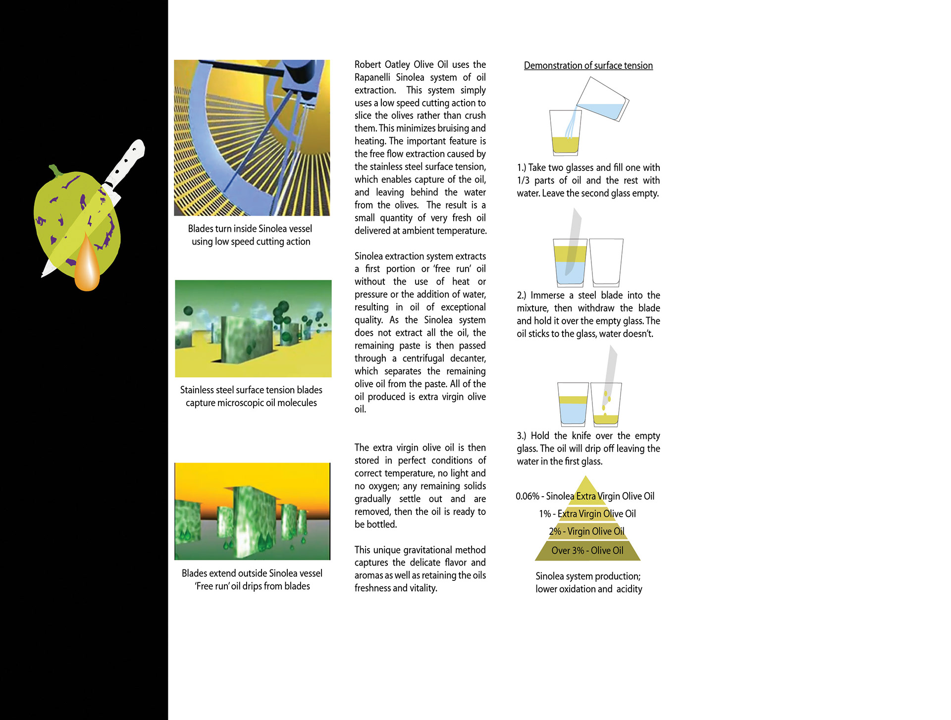
Box insert explains the process of product production, and why the oil is so near perfect... and expensive. This information for the purchaser can be used in display for in store sales demo.
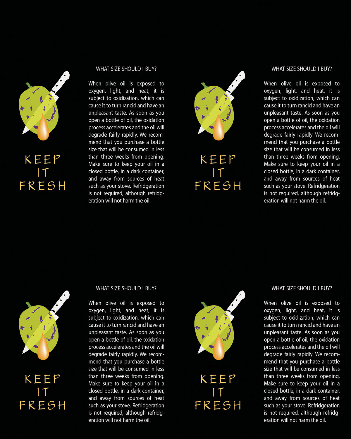
Here is a (four on this card) card that to be placed on store shelf in front of product. Twice as wide as the box, therefor (somewhat) forcing the shelf stocker to display two rows of this olive oil. The info on the tag helps the purchaser understand that this smaller bottle is better to purchase than a larger size.
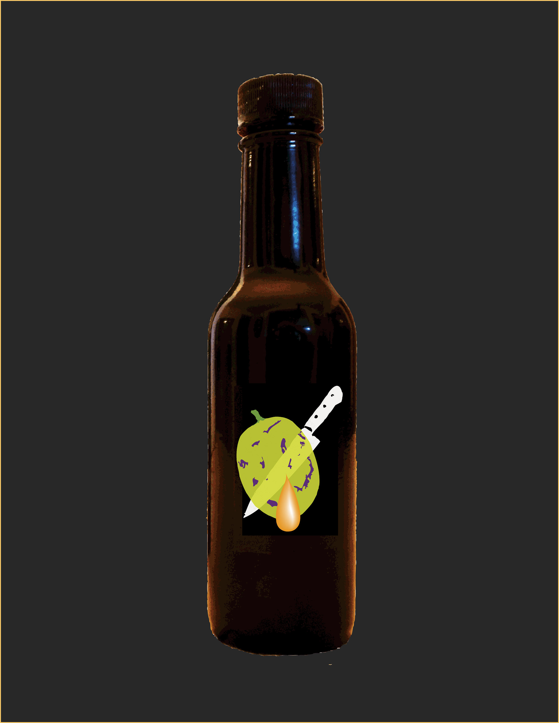
Bottle and the box front... the bottle would have only this recognizable symbol
Designed much like the lines of a fine european automobile, sleek and classy.
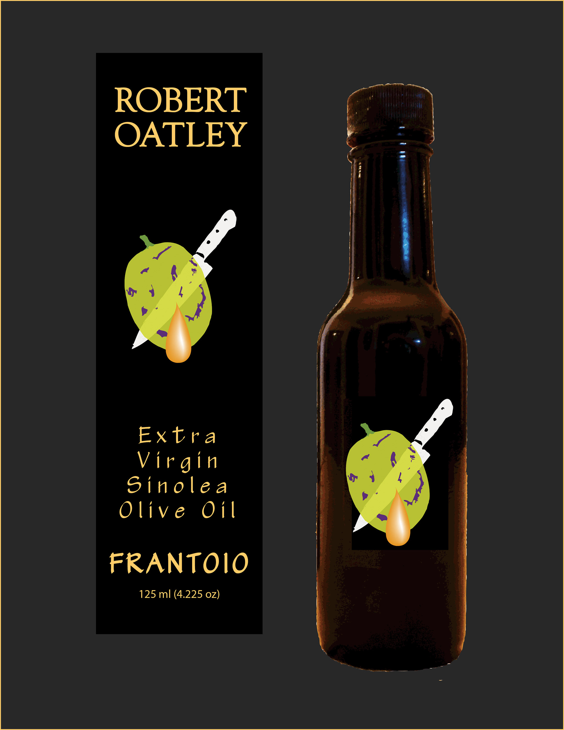
The bottle...